
Using Dataview with Charts in Obsidian
Obsidian is my third most used application after Keyboard Maestro and Alfred. I’ve been using the dataview plugin since I got started with Obsidian. It’s an incredible plugin that gives you the ability to treat your notes like database records. In this example I’ll show how I use dataview to make my projects queryable, and then how I use Obsidian-Charts to make some bar charts of this data.
Using Dataview Variables
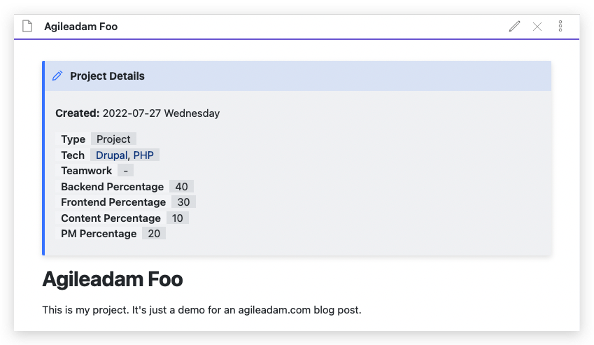
Here’s an example of a Project file in my Obsidian vault:
|
1 2 3 4 5 6 7 8 9 10 11 12 13 14 |
> [!NOTE] Project Details > **Created:** 2022-07-27 Wednesday > > [Type:: Project] > [Tech:: [[Drupal]], [[PHP]]] > [Teamwork:: ] > [Backend Percentage:: 40] > [Frontend Percentage:: 30] > [Content Percentage:: 10] > [PM Percentage:: 20] # Agileadam Foo This is my project. It's just a demo for an agileadam.com blog post. |
Here’s the template file I use for my projects:
|
1 2 3 4 5 6 7 8 9 10 11 12 13 |
> [!NOTE] Project Details > **Created:** <% tp.date.now("YYYY-MM-DD dddd") %> > > [Parent:: [[MaineHealth Projects MOC]]] > [Type:: Project] > [Tech:: ] > [Teamwork:: ] > [Backend Percentage:: ] > [Frontend Percentage:: ] > [Content Percentage:: ] > [PM Percentage:: ] # <% tp.file.title %> |
In my project pages I’m making use of Obsidian variables that are defined inline. You can also define them in the YAML frontmatter of any file.
Querying with Dataview
Obsidian dataview lets me query the files in my vault using those variables. Here’s a straightforward example making use of the variables shown above:
|
1 2 3 4 5 6 7 8 9 10 11 12 13 14 15 16 |
--- cssclass: academia, academia-rounded --- ```dataview TABLE backend-percentage as "% Backend", frontend-percentage as "% Frontend", content-percentage as "% Content", pm-percentage as "% PM", join(tech, ", ") as "Tech" WHERE type = "Project" AND !contains(file.path, "System") SORT file.name LIMIT 3 ``` |
The result of this is a table, shown here with a bit of CSS applied.
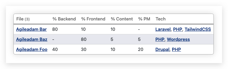 Pretty cool, right? This table is updated in near real-time when any of the included data in my vault changes.
Using Dataview Results with Obsidian-Charts
In order to use dataview results as the data for Obsidian Charts I used the dataviewjs aspect of dataview.
After a lot of trial and error I finally understood how to query for the raw data from dataview and interpret/modify/use that data.
Here’s the final result:
|
1 2 3 4 5 6 7 8 9 10 11 12 13 14 15 16 17 18 19 |
```dataviewjs const rawData = await dv.query('TABLE file.name, backend-percentage, frontend-percentage, content-percentage, pm-percentage WHERE type = "Project" AND !contains(file.path, "System") SORT file.name LIMIT 3'); const rows = rawData.value.values; const chartData = { type: 'bar', data: { labels: rows.map(x => x[1]), datasets: [ {label: 'Backend', data: rows.map(x => x[2]), backgroundColor: ['#2D3142']}, {label: 'Frontend', data: rows.map(x => x[3]), backgroundColor: ['#EF3054']}, {label: 'Content', data: rows.map(x => x[4]), backgroundColor: ['#43AA8B']}, {label: 'PM', data: rows.map(x => x[5]), backgroundColor: ['#C7F2A7']}, ], }, } window.renderChart(chartData, this.container); ``` |
The result looks like this:
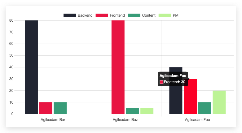
As I said, it took some trial and error to get here. I knew I had a working query (from the section above) so it was simply a matter of getting it into the chart. I read through the documentation for dataviewjs and determined I needed to use dv.query() . I used console.log(rawData) to explore the results (after opening the developer tools in Obsidian via View > Toggle Developer Tools). After determining where the data was in the results I was able to work up some javascript to build out the data arrays that I thought Obsidian-Charts was expecting. I was awfully confused by the labels and data that Obsidian-Charts uses. The whole chart has labels and each dataset has a label. Eventually I figured it out — the top-level labels are the “columns” on the X axis; the other labels are repeated for each value in their associated data array; think of if this way… each dataset (e.g., Backend) is an array containing the value (e.g., 40) for each master label (e.g., Agileadam Foo). So in this example there are 3 elements in each of the four datasets — one for each of the Agileadam * projects.
The code above is the final refactoring of the following, which may be easier for you to digest if you’re not used to array maps:
|
1 2 3 4 5 6 7 8 9 10 11 12 13 14 15 16 17 18 19 20 21 22 23 24 25 26 27 28 29 30 31 32 33 34 35 36 37 38 39 40 41 42 43 44 45 46 47 |
```dataviewjs const rawData = await dv.query('TABLE file.name, backend-percentage, frontend-percentage, content-percentage, pm-percentage WHERE type = "Project" AND !contains(file.path, "System") SORT file.name LIMIT 3'); const rows = rawData.value.values; let backend = []; let frontend = []; let content = []; let pm = []; let labels = []; for (let row of rows) { labels.push(row[1]); backend.push(row[2]); frontend.push(row[3]); content.push(row[4]); pm.push(row[5]); } const chartData = { type: 'bar', data: { labels: labels, datasets: [{ label: 'Backend', data: backend, backgroundColor: ['#2D3142'], }, { label: 'Frontend', data: frontend, backgroundColor: ['#EF3054'], }, { label: 'Content', data: content, backgroundColor: ['#43AA8B'], }, { label: 'PM', data: pm, backgroundColor: ['#C7F2A7'], }], }, } window.renderChart(chartData, this.container); ``` |
Also, it may be helpful for you to see was “rows” looks like. Here’s an example:
|
1 2 3 4 5 6 7 8 9 10 11 12 13 14 15 16 17 18 19 20 21 |
/** * EXAMPLE data for the "rows" variable: */ const rows = [ [ 'SomeFileName.md', // Filename 'Some File Title', // Title 60, // Backend percentage 30, // Frontend percentage 4, // Content percentage 6, // PM percentage ], [ 'AnotherFileName.md', 'Another File Title Here', 25, 25, 10, 40, ], ]; |